Before starting
This article will explain how your layout can be adapted to be responsive on mobile. This is also known as Responsive Design (optimized for mobile devices).
The Responsive Design
The Responsive Design automatically adjusts the display of a web page to the screen size of the device you are using (smartphone, tablet, desktop, etc.).
It is a question of adapting the site to all resolutions. In other words, the blocks of content (text and images) are resized and reorganized according to the space available on the screen.
How to proceed?
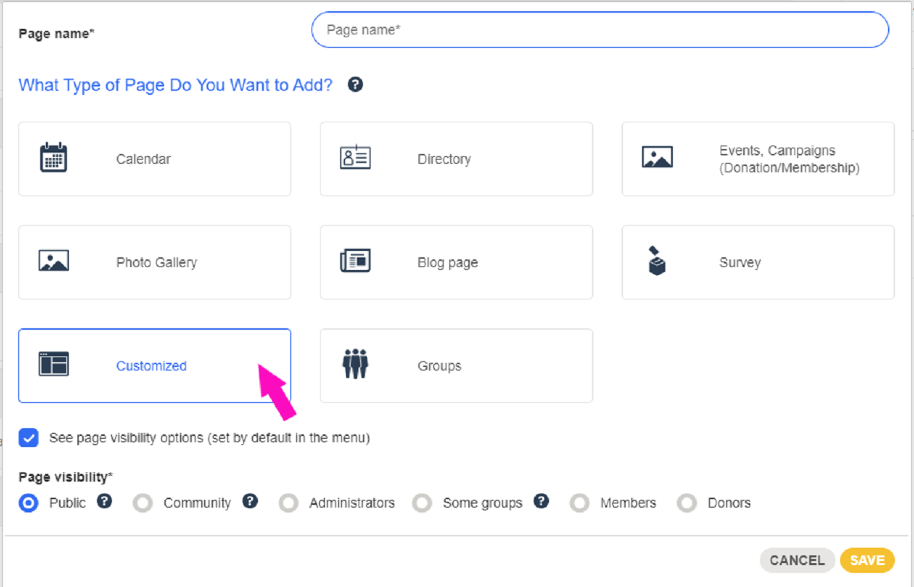
1. Create a customized page
Go to the page Website > Menus and pages and create a customized page.
2. Text block
Once on the page, select the text block and drag it onto the checkerboard.
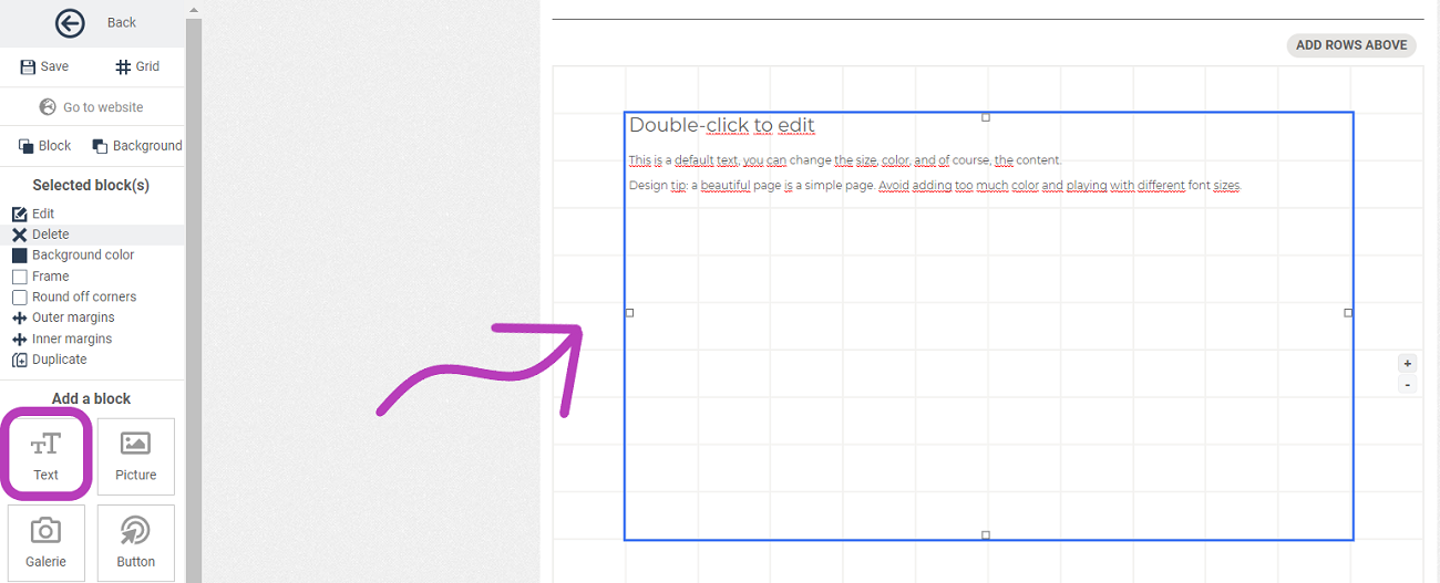
3. Add content
You can now add elements directly in this block.
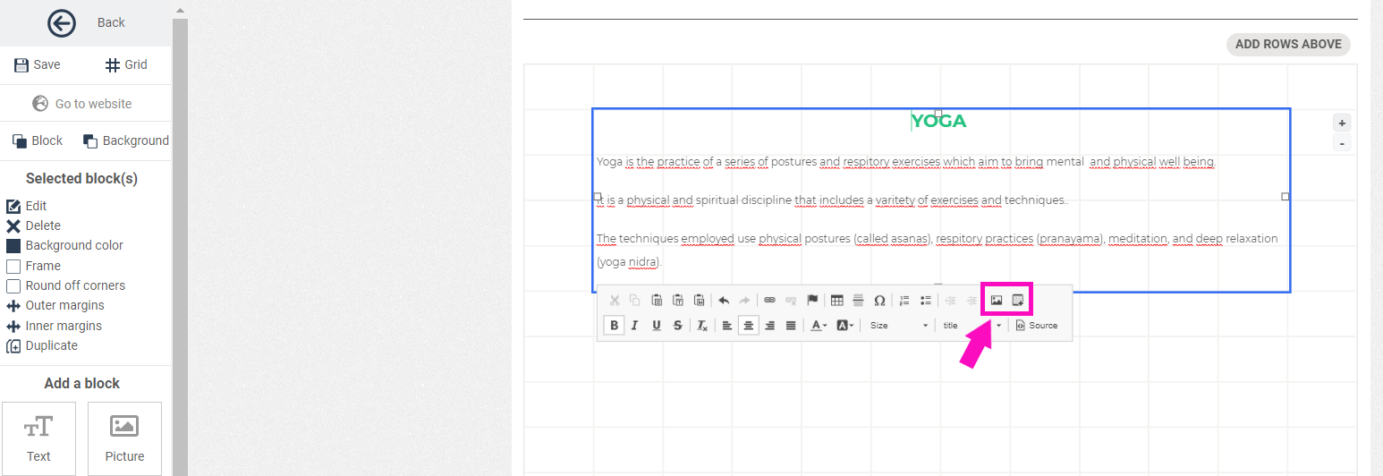
4. Add an image
In the same block, click on the image option in the editing panel.
Next, click on Upload > Choose File > Send it to the Server
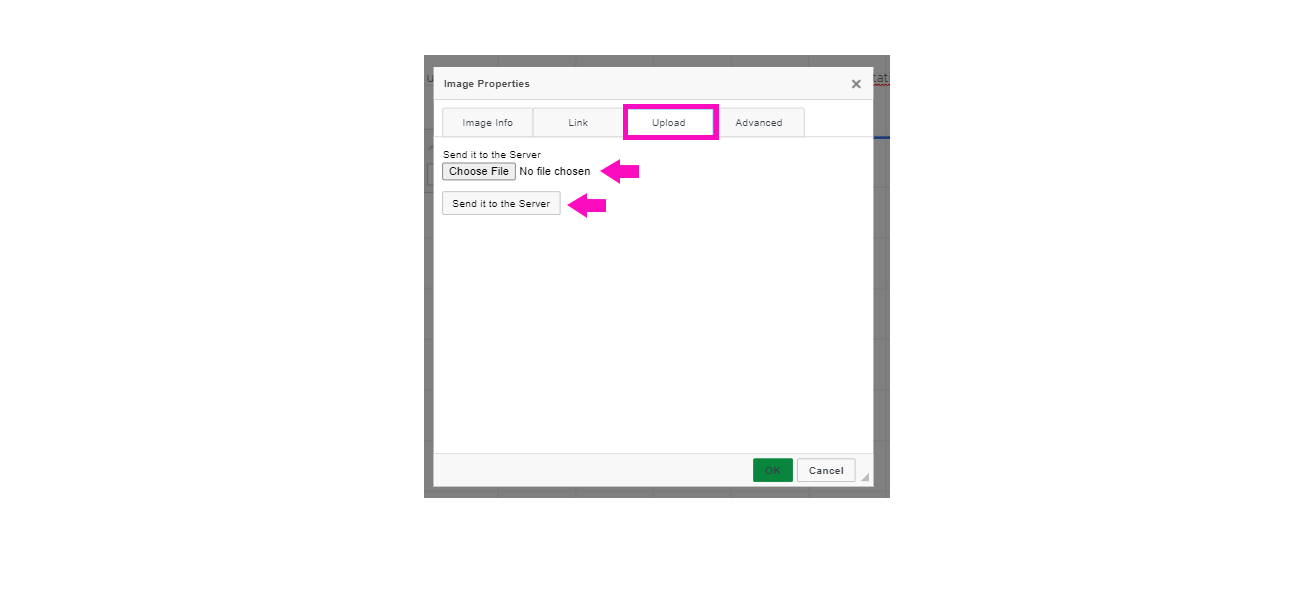
You will then be automatically directed to the image properties where you can readjust the height and width of the image. Press OK to save it.
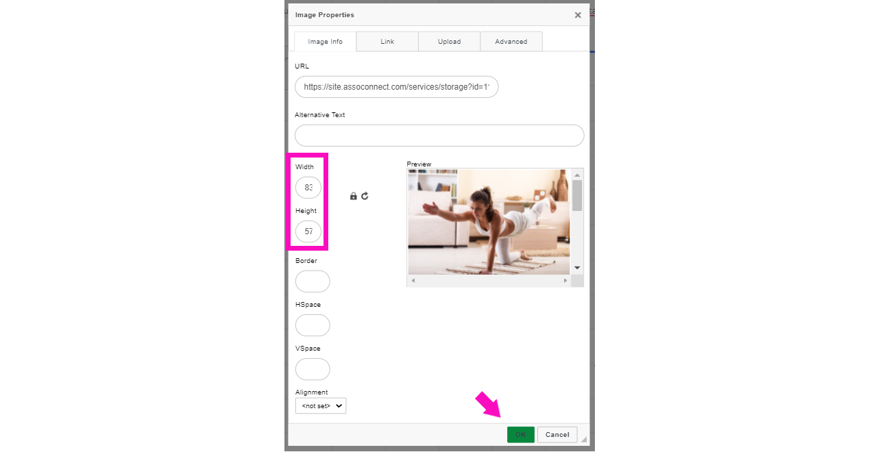
Do not use the image option from the menu on the left because images added with this option are centered responsively, but not resized.
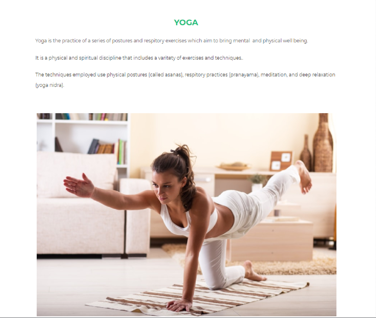
See the presentation on the Website in Desktop version
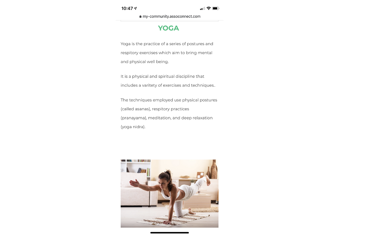
See the presentation in the mobile version
Comments
0 comments
Article is closed for comments.